Writing Oranges and Lemons has been a long journey. One I began several years ago. At that time, it was hard to imagine even completing the story, never mind holding it in my hands as a physical book.
Even now, as its publication date draws ever closer, I can’t properly imagine how it will look or feel. The images in my mind’s eye are of slightly off-white pages, each numbered; there is a beautiful cover designed by Jill Calder with her skilfully crafted images full of movement and energy and awash with colour and texture; and the Matador logo will sit on the spine and the barcode (with my ISBN) on the back cover.
But how will it look?
I got an inkling a few weeks ago when I received the Style Proof from Matador. It was a moment of enlightenment. It was also an opportunity for me to enter into a debate with Matador about what would be right for my book.
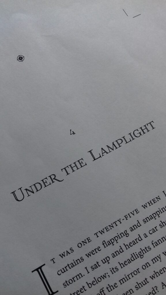
There were questions I had to ask myself when I received the package from the publisher. Inside were the first twenty pages of Oranges and Lemons, printed on standard A4 laser printer paper with only the central section of the page occupied. Crop marks surrounded the text, marking the four page corners to the exact dimensions of the finished novel. The pages looked small surrounded by so much naked, white paper. Yet, when I cut them out, using the crop marks as a guide, suddenly I had a glimpse of how my finished book might appear. And the size was exactly as you’d expect for a paperback novel.
So what did I have to ask myself?
• Did I like the way it looked?
• Did the font suit the genre and tone of the book?
• Was the font size appropriate for the reading age of my target audience?
• Did the chapter headings stand out? Did they set the reader up for the next stage of the story?
• Did the page numbers sit where I wanted them to and, again, did the font sit well with the genre?
I had to conclude that whoever decides on the style had done a great job. I was thrilled with the effect; I love the font; I love the capitalised first line and the decorative first letter of each chapter; and I commend Matador for doing such a great job. I’ve included a little slice of a page in the photo above and I hope you’ll agree, it looks great!
Now, I am that much closer to having a book!
I hope you are enjoying reading about my experience of having my first book published. Come back next week for another wee sample of what Jill Calder is creating, right now, for Oranges and Lemons.
Great insight to the birth of a book.
Thanks for your feedback, Patrick. . . much appreciated.